Roulette · Daily read
Why Online Roulette Looks Different Everywhere: A Story of Aesthetics and Math
I played roulette online for six months before I noticed that the games looked different everywhere. That difference was not accident. It was design.
By Sam Ortega, 2 min read
Day197
Entered under Roulette.
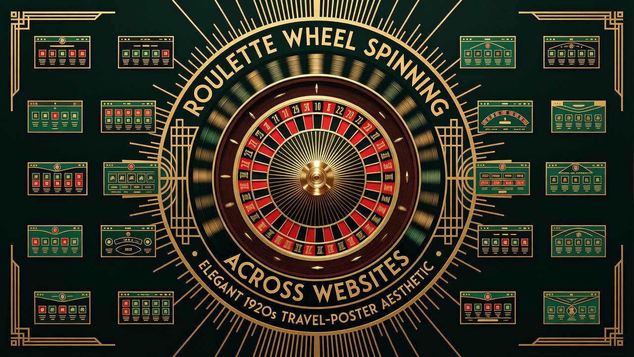
I started playing roulette online during the pandemic like a lot of people did. Isolation. Free time. An app on my phone. The progression was fast.
At first, I played on PokerStars Casino. The roulette wheel was sleek. Modern. Minimalist. At DraftKings, the wheel was ornate. Vegas-style. Lots of chrome. At BetMGM, it was somewhere in between.
I noticed this for the first time in month four of playing. I switched between apps so often that I did not realize the games looked different. I thought there was one roulette game and different casinos hosted it.
Then I realized: each casino had commissioned their own version of roulette.
Why? The mathematics are the same. The house edge is the same. The probability is the same. A 37:1 wheel is a 37:1 wheel no matter what it looks like.
But the experience is different. A sleek, modern wheel feels like a product designed for the 21st century. An ornate wheel feels like you are in Las Vegas in 1985. The psychology of the experience matters.
The Design Matters
Casinos know this. The look of the game influences how you feel about the game. A wheel that spins fast feels lucky. A wheel that spins slow feels deliberate. The sound design affects your sense of control. The colors affect your sense of prestige.
So each casino has a design language. PokerStars is minimalist, like a tech company. DraftKings is flashy, like traditional Vegas. BetMGM is in between, trying to seem both legitimate and fun.
None of this changes the game. It just changes how you feel while you play. And how you feel while you play determines how much you are willing to lose.
What Changed
I eventually quit playing roulette online. Not because of the graphics. Because of what the graphics were hiding. The different designs were a distraction from the fact that I was losing money at the same rate to the same mathematics, just with different aesthetic wrapping.
The sleek wheel did not make the game better. The ornate wheel did not make me luckier. The difference in design was camouflage for identical odds.
Online roulette looks different everywhere because casinos want you to think the experience is unique. The math is always the same.
I realized after I stopped that the whole point of the design variation was to make you stop comparing. If every online roulette game looked identical, you would be confronted with the reality that you are always playing the same game at the same odds. The variation in design lets you pretend you are shopping for different products when you are actually just picking the same product with different packaging.
If you play roulette online, ignore the graphics. They are designed to make you play longer. Play with discipline. Set a budget. Stick to it. Do not let the aesthetic differences trick you into thinking one casino is better than another. They are selling the same game. The house edge is the same.
End of the entry for Day 197